
Cuoco Black trained his mind before focusing on training his body, but the results were life-changing. A former academic, he felt disappointed by the gyms he frequently visited. He took his background in interior design, and combined it with his love for the fitness industry. Today his work features wildly expressive takes on pop culture that make gym members protagonists in iconic Hollywood movies from Terminator, Rocky and even Star Trek.
We sat down with Cuoco to discuss what he sees as a creative bankruptcy plaguing gym design in the United States. As the designs driving the commercial success of Orange Theory, Soul Cycle, Planet Fitness, and Equinox become the industry norm, Black’s bold aesthetics have made him the goto designer for emerging gym owners looking to quickly establish a loyal client base. The reason? His project explore new ways of engaging members, and encouraging positive training atmosphere’s that creates fluid relationships between members, staff, and the increasing number of high tech products at their disposal like the Styku 3D body scanner.
Styku: Can you tell us a bit about how you got started in fitness center and gym design?
Cuoco Black: I was an academic first and former faculty member of the New York School of Interior Design. I got into nutritional health and became a natural bodybuilder. When I was training in gyms, I would think, “These suck,” and I knew I could do better, so I started marketing myself as the "bodybuilding gym designer" but that has changed a bit.
As time went on, I moved away from the physical fitness side, but I stayed strong in the academic side and studied the industry. I looked at the trends and innovations, as well as new product development. I believe the industry is trapped in a dust spiral of what I call “better sameness. I realized that every market category, every segment, for example, CrossFit, all look the same. All the CrossFit boxes more or less look like other CrossFit boxes. If you look at the $10 big box gyms, they have a logo, a slogan, a two or three-color scheme, and a fleet of equipment. If you look at the franchise model, it’s a $40 price point, a stripe on the wall and a lot of PR promotion, Soul Cycle, Orange Theory, Pure Barre it’s all the same.
Within each market category, there were people copying other models, so I started to tell them they needed to distance themselves from that laziness. The only way to do that is to come up with an innovative conceptual gym that puts you on a different level. I started to tell people they needed to do a few things differently, and it took off like wildfire.
Styku: Can you give us an example of that?
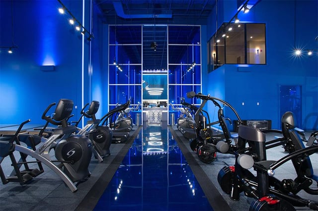
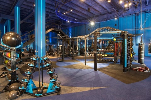
Cuoco Black: For example I told Trainerspace they needed a Styku room, and that they needed a conceptual gym model. We centered the whole gym around the “Tron: Legacy” movie. All the lighting in the gym looks like the "Tron" film. We came up with a conceptual idea in order to standout in the marketplace where everybody is trying to look like an Equinox, Life Fitness, Planet Fitness, or Power House. So when you drop in a model referencing "Tron" you separate yourself from everybody in the industry. There is nothing like it, and no one can copy it because it is so distinctive.
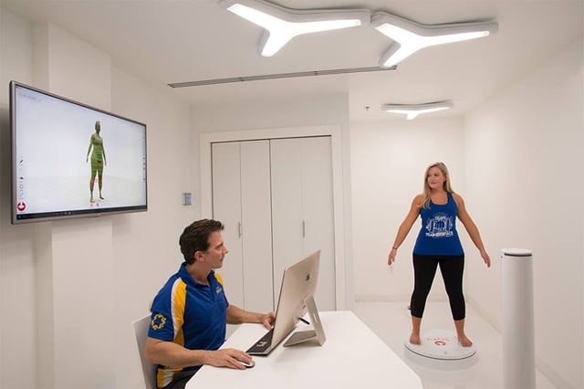
You need to create a concept beyond what everyone else is doing. You have to be innovative, so if you look at the Styku room - the whole room looks like something out of a futuristic movie set. The lighting fixtures and finishes are all white and connects the customer’s aesthetic to the whole gym. The concept of the gym is futuristic, from the color scheme to the material, All these things coexist into a conceptual innovative gym model.
Styku: We’re curious to understand what drives the movie themes at the core of your creative process?
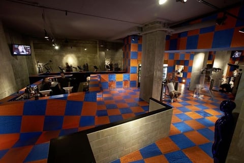
Cuoco Black: Yes, it is interesting because you have picked up on something that a lot of people don’t recognize. If you look at the Mid-City Gym project, it’s inspired by the gym where Arnold Schwarzenegger used to train back in the 80’s. So we said to the client, “you should come up with a conceptual idea for your gym and we will drive the design trajectory.”
Instead of trying to copy everybody else, we came up with a concept that linked back to “The Terminator” film. We made the flooring meld into the reception desk and into the walls, which then melted into the ceiling to mimic the hospital scene in “Terminator 2” where the T1000 came out of the floor. We took these types of elements and added metallic mannequins, added bullet holes to the orange mirror, and added concrete walls to give it this post-apocalyptic feel.
Even though we didn’t use the same theme as the Universal Studios ride, it is conceptually inspired in a similar way, and Mid-City gym is doing extremely well as a result. My impetus is to help my clients deliver a product to the marketplace that is unlike anything out there, and get get consumers to buy into it.
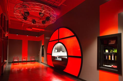
Consumers are savvy about design nowadays through reality TV shows, and Instagram. Look at Red Gym Source Fitness- the owner was inspired “Rocky,” so the gym has big, theatrical trusses and lighting. He also was into ancient Chinese mythology, so the reception desk looks like a moon gate, which is a Chinese arch. Each of the projects come from my mindset to create an innovative gym where there is nothing else in the marketplace like it. By focusing on that I help my clients eclipse competitors in the market.
Styku:.Do you find that people react positively to the themes?
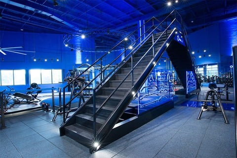
Cuoco Black: The purpose of the design is marketing first. It is like an Apple Store, you go, “wow, there is the design, the product, the salesperson and the brand.” When I do these designs, it is not necessarily the aesthetics - it is the marketing appeal of the total package. When you walk into one of these gyms, you are like, “wow, this is really something special,” so what we are doing is triggering the fitness consumers to think differently about a cool space. We want them to think about how they can be a part of this brand.

Aesthetics becomes a powerful component of the sales process, because when people come in and see the reception area, like at Trainerspace, their jaws drop since they have never been in a gym like it before. The owner says it is like they are falling over the edge of a roller coaster, and that helps capture the prospect psychologically. I told the owner, Carey that he needed to make the Styku room into the sales office at Trainerspace to complete the experience. So, instead of having a desk with a salesperson trying to sell you a deal, we bring them into that Styku room that is all futuristic. We put people up on the Styku and it seals the deal - it is part of the pre-sale marketing idea. The Styku ends up being a futuristic part of the sales and marketing.
Styku: That is interesting, we've heard a lot of about how Styku helps break down the barriers by establishing a relationship with a potential new gym member. Can you tell us how the design of that room plays into that?
Cuoco Black: The Styku obviously wasn’t the core component of the customer’s business model for a private appointment-only personal training studio. But it integrated nicely into the concept we were creating. The design process begins by taking the gym’s logo, color scheme and business model, create the concept and apply it to the reception area, locker rooms and training areas, which are always the areas to focus on initially.
The Styku room started to play a big role as we thought about the pre-sale tour. It is usually in that process that people walk through the club, come into the reception area, to the lobby and to the training room. We walk them through the locker rooms, but on the way out where you would traditionally make the sale by sitting them at a desk in an office, instead you bring them into the Styku room to show them the scanner and how it works. So the design of the Styku room had to reinforce the concept, color scheme, logo and brand aesthetics. The Styku room became the sales tool that closed the deal in the pre-sale tour, but it had a backlink to the whole brand platform - the logo, color scheme, business model and brand aesthetics, like the concept of the Tron gym.
Styku: You are upending the notion of selling a gym membership so that it doesn’t feel like an office, is that right?
Cuoco Black: Yes that was the whole thing. Typically after touring a gym you would go into a gym sales office there would be a desk and a chair, and a salesperson would pull out a contract, and all of sudden you’re under pressure to make the deal. So the idea here is to remove peoples inhibitions and barriers to entry.
After a potential member has toured the gym and they’ve seen the locker rooms, the training floor, and the reception area they come into the Styku room. Suddenly it no longer a sales room, and the potential member is attracted to the technology-they’re pulled in by it.
My objective when creating these designs it to introduce some motivational aesthetics, or something that telegraphs fitness and exercise. If you look at the gyms we have done, all of them have this amplified atmosphere that is motivational and exciting, and it inspires people to train. My clients are so freaking successful when they follow this path.
The guy behind Trainerspace used to own a Planet Fitness. He called me and said “we need you to develop our gym model,” you know when that happens, Ithat you’re pushing the industry in a new direction, and Styku is the future of fitness. These conceptual gyms are the new disruptors.
When Trainerspace first came out I posted pictures on that and it went direct to a firestorm on LinkedIn. Someone commented on the picture “this is the perfect ergogenic fitness center”, I had never heard that word so I looked up Ergogenic and it means ‘intended to enhance physical performance, stamina, or recovery.’
We try to amplify this environment that is inspirational and that motivates people to train, and we end up creating a gestalt. Which means when the individual parts come together they have a bigger message.
What’s really nice about Styku is it makes technology tactile. It is something that you can see, that you can touch. I think a lot of technology in the fitness industry is overrated, its tech without that human element. That’s where Styku really helps drive home the idea of erogenic gestalt. It also looks pretty cool, like something right out of Star Trek.
Styku: What was that room called, the transporter room?
Cuoco Black: Yeah, that’s what I am saying, we wanted to create that futuristic environment. When someone stands on the Styku turntable we wanted to the feel like they were beaming up, or being teleported, like in Star Trek.
Notice the lighting fixtures and the sterile white environment, it looks right out of a scene of looks like it is right out of Star Trek. It goes a little deeper than that; I am trying to bring the fitness consumers into a movie or a theatrical play, so they now become players. They’re now part of something completely removed from what they experience at home, or at work. It’s very different from a traditional gym.
Styku: I think I get your point; essentially you are doing an analysis of the fitness industry from a design perspective and then when someone comes to work with you, essentially you are saying “Here is how I am going to help you stand out. Here is how I can create something completely different for you.”
Cuoco Black: Yes, customers will come to me with pictures of Equinox and say “I want to do this." I will explain to them why you don’t want to do that and I will show them a picture of a McDonald’s that looks like an Equinox.
I blogged about this before I said don’t be a Gym McDonald’s, don’t try to be an Equinox, because all you are doing is copying the boutique design trend. What happens is [developers] come to me and say they want to do this franchise model. So I will take the franchise model, lets say it's Orange Theory, and I breakdown exactly how Orange Theory does their branding.
In the case of Trainerspace I said “okay we know what Equinox does for design and we know what Lifetime does for design, let me show you an image of what I believe you should move the gym towards”, then I show them the interior photographs, images, screen captures form "Tron." They see a gym inspired by this cool concept and we bring technology into the fold with the Styku room.
Don’t forget, really for the gym developer who is purchasing the product, the scanner helps close the sale. The Styku room is the last room prospects see before a sale is made. So don’t forget the importance of the Styku for driving revenue, it’s more than just design.


